SVG基础知识
效果链接 https://github.com/weibsgz/svg-
svg 基础知识
设置颜色 可以 stroke=”red”这种具体色值 也可以 currentColor 继承父级颜色
1
2
3
4
5
6
7
8
9
10
<!-- 竖十字 -->
<div style="color: red; width: 100px; height: 100px;">
<svg width="100%" height="100%" >
<line x1="0" y1="50" x2="100" y2="50" stroke="currentColor"
stroke-width="5" />
<line x1="50" y1="0" x2="50" y2="100" stroke="currentColor"
stroke-width="5"/>
</svg>
</div>viewBox 的意义 :如果设置了画布大小是固定值,随着容器的大小变化,
那么可能 SVG 的图像就显示不全了
viewBox 的四个参数分别代表:最小 X 轴数值;最小 y 轴数值;宽度;高度。
可根据视窗自动放大缩小1
2
3
4
5
6
7
8<div style="color: red; width: 20px; height: 20px;">
<svg viewBox="0 0 100 100" >
<line x1="0" y1="50" x2="100" y2="50" stroke="currentColor"
stroke-width="5" />
<line x1="50" y1="0" x2="50" y2="100" stroke="currentColor"
stroke-width="5"/>
</svg>
</div>再来一个详细的列子 说明 viewBox
这是外部容器宽度 500 _ 200 缩放比是 500/50=10 200/20=10
rect 矩形的实际宽度是 width _ 缩放比 height * 缩放比 就是宽 100 高 50
包括 x y 的起始坐标点,stroke-width 默认是 1 也会都乘以 10### preserveAspectRatio 属性1
2
3<svg width="500" height="200" viewBox="0 0 50 20" style="border: 1px solid red;">
<rect x="20" y="10" width="10" height="5" style="stroke:rgb(0,0,0); fill:none"></rect>
</svg>默认参数是 xMidYMid Meet 共有 9 个属性
xMinYMin,
xMinYMid,
xMinYMax,
xMidYMin,
xMidYMid,
xMidYMax,
xMaxYMin,
xMaxYMid,
xMaxYMaxpreserveAspectRatio 第二个参数 meet 代表保持宽高比将 viewBox 缩放为适合 viewPort 的大小
meet 模式下,SVG 将优先采纳压缩比较小的作为最终压缩比,meet 为默认参数,比如下边是宽的压缩比
是 500/200=2.5 高是 200/200=1 所以 viewBox 的还是维持 200 _ 200
下边 rect 实际宽高比率是 1 就是维持 100 _ 50
1
2
3<svg width="500" height="200" viewBox="0 0 200 200" style="border: 1px solid red;">
<rect x="100" y="100" width="100" height="50" stroke-width="10px" style="stroke:rgb(0,0,0); fill:none"></rect>
</svg>如下图 viewBox 实际是显示区域内按照默认的 xMidYMid 对齐方式 占了一块 200 * 200 的区域
我们的 RECT 要在这个区域内显示 他的 x y 是按照 viewBox 这个区域设置的
如果我们设置了
preserveAspectRatio = "xMaxYMin meet"那么显示区域就在最右边
其他属性同理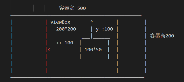
preserveAspectRatio 第二个参数还可以是 slice 代表保持宽高比将所有不在 viewBox 的裁剪掉
slice 模式下,SVG 将优先采纳压缩比较大的作为最终压缩比以上代码 2.5 就是他采用的压缩比 因为设置的是 Ymax 那么 viewBox 的底部和容器重合,顶部变为 viewBox 的第四个参数 200 高度 * 2.5= 500 所以 viewBox 变为 500 高将超过容器的高度 rect 矩形的宽高也都将*2.5 x,y 也会都乘以 2.51
2
3<svg width="500" height="200" viewBox="0 0 200 200" preserveAspectRatio="xMidYMax slice" style="border: 1px solid red;">
<rect x="100" y="100" width="100" height="50" stroke-width="10px" style="stroke:rgb(0,0,0); fill:none"></rect>
</svg>preserveAspectRatio 第二个参数还可以是 none 代表不保持宽高比
preserveAspectRatio="none"那么 rect x,width 都乘以 2.5 y,height 都乘以 1svg 动画
transform :translate 偏移量
transform :rotate 旋转
tranform: skewX 倾斜
transform :scale 缩放
1
2
3<svg width="500" height="200" viewBox="0 0 500 200" style="border: 1px solid red;">
<rect x="0" y="0" width="50" height="50" fill="red" transform = "translate(10,10) rotate(30) skewX(30)"></rect>
</svg>matrix 复杂变形
1
2
3
4
5
6
7
8
9
10先分为2组,然后套用公式
[2,-1,50] => 新X坐标 = 2*x + (-1)*y + 50
[1,2,0] => 新Y坐标 = 1*x + 2*y + 0
新的4个顶点坐标:
[0,0] => [50,0]
[100,0] => [250,100]
[100,50] => [200,200]
[0,50] => [0,100]### 环形进度条1
2
3
4<svg width="500" height="200" viewBox="0 0 500 200" style="border: 1px solid red;">
<rect x="0" y="0" width="50" height="50" fill="red"
transform = "matrix(2 1 -1 2 50 0)"></rect>
</svg>cx 和 cy 属性定义圆点的 x 和 y 坐标。如果省略 cx 和 cy,圆的中心会被设置为(0, 0)
r 属性定义圆的半径
martix 的作用在此图是为了让圆圈进度条起始位置在正上方,也就是说要旋转这个圆
套入上边的公式 要解方程式1
2
3
4
5
6
7
8
9
10
11<div class="container">
<svg width="440" height="440" style="border: 1px solid red;" viewBox= "0 0 440 440">
<!-- 第一个圆圈作为背景 -->
<circle cx="220" cy="220" r="200" stroke-width="20" stroke="#ccc" fill="transparent"></circle>
<!-- 第二个进度 -->
<circle class="circle"
transform = "matrix(0 -1 1 0 0 440)"
cx="220" cy="220" r="200"
stroke-width="20" stroke="blue" fill="none"></circle>
</svg>
</div>1
2
3
4
5
6
7
8
9
10
11
12
13
14
15
16
17
18
19
20
21
22<style>
/*
1131是圆的周长 2 * 3.1415926 * 200 = 1257
stroke-dasharray 第一个参数代表绘制的进度长度 第二个参数代表 空白长度
进度条就是让10 一直增长到1131就可以了
*/
.circle {
animation: circle 5s linear infinite;
}
@keyframes circle{
from{
stroke-dasharray: 10 1257;
}
to{
stroke-dasharray: 1257 0;
}
}
</style>path
1.从 icon font 下载 图形 SVG 代码
1
2
3
4
5
6
7
8
9
10
11
12
13
14
15
16
17
18
19
20
21
22
23
24
25
26
27
28
29
30
31
32
33
34
35
36
37
38
39
40
41
42
43
44
45
46
47
48
49
50
51
52
53<style>
.logo{
fill:white;
stroke:#333;
stroke-width: 5px;
/* 1代表只执行1次 forwards代表执行完毕后停留在最后的状态 */
animation: logo 5s linear 1 forwards;
}
@keyframes logo {
0% {
fill:white;
stroke:#333;
/* 通过path.getTotalLength()获得PATH的长度 */
stroke-dasharray: 5962;
/* 正数偏移相当于向左偏移 初始就是看不见了*/
stroke-dashoffset: 5962;
}
50%{
fill:white;
stroke:#333;
stroke-dasharray: 5962;
/* 正数偏移相当于向左偏移 初始就是看不见了*/
stroke-dashoffset: 0;
}
75% {
fill:red;
stroke:white
}
100% {
fill:blue;
stroke:white
}
}
</style>
<div>
<svg viewBox="0 0 1024 1024" width="200" height="200">
<path class="logo" d="M261.888 64c111.68 0 176.192 30.208 252.352 93.632 220.928 0 400 171.904 400 384 0 212.064-179.072 384-400 384s-400-171.936-400-384c0-127.904 65.152-241.216 165.312-311.008C264.16 153.344 150.272 64 261.888 64z m42.144 65.76c11.008 18.432 18.56 32.48 25.12 47.52 4.512 10.368 8.128 20.544 10.816 30.688l2.368 10.176 8.16 41.056-34.368 23.936c-86.208 60.064-137.92 155.232-137.92 258.496 0 176.128 149.888 320 336 320 186.176 0 336-143.872 336-320 0-173.216-144.864-315.2-326.72-319.872l-9.28-0.128h-23.136l-17.792-14.816C414.4 157.76 369.28 135.776 304 129.76z m127.968 283.84a48 48 0 0 1 48 48v96a48 48 0 0 1-96 0v-96a48 48 0 0 1 48-48z m256 0a48 48 0 0 1 48 48v96a48 48 0 0 1-96 0v-96a48 48 0 0 1 48-48z"></path>
</svg>
</div>
<script>
window.onload = function() {
const logo = document.getElementsByClassName('logo')[0];
console.log(logo.getTotalLength()) //5962
}
</script>1
2
3
4
5
6
7
8
9
10
11
12
13
14
15
16
17
18
19
20
21
22
23
24
25
26
27
28
29
30
31
32
33
34
35
36
37
38
39
40
41
42
43
44
45
46
47
48
49
50
51
52
53
54
55
56
57
58
59
60
61
62
63
64
65
66
67
68
69
70
71
72
73
74
75
76
77
78
79
80
81
82
83
84
85
86
87
88
89
90
91
92
93
94
95
96
97
98
99
100
101
102
103
104
105
106
107
108
109
110
111
112
113
114
115
116
117
118
119
120
121
122
123
124
125
126
127
128
129
130
131
132
133
134
135
136
137
138
139
140
141
142
143
144
145
146
147
148
149
150
151
152
153
154
155
156
157
158
159
160
161
162
163
164
165
166
167
168
169
170
171
172
173
174
175
176
177
178
179
180
181
182
183
184
185
186
187
188
189
190
191
192
193
194
195
196
197
198
199
200
201
202
203
204
205
206
207
208
209
210
211
212
213
214
215
216
217
218
219
220
221
222
223
224
225
226
227
228
229
230
231### SVG SMIL 动画
1. <set> 延迟功能。就是指:可以在特定时间之后修改某个属性值(也可以是 CSS 属性值)。
2. <animate>
- 类似 css3 keyframes
3. <animateColor>
- 已废弃 用animate就可以实现改变颜色
4. <animateTransform>
- 主要使用type 属性 改变大小之类的
5. <animateMotion>
- attributeName 设置哪个属性要动
- attributeType 要过度的是 xml
- to 移动到的位置
- begin 开始的时间
- dur 持续时间
- repeatCount 动画执行的次数,"indefinite"表示无限循环
- fill 不同于 SVG 上的填充色 这里是动画间隙的填充方式:freeze/remove
- type transform 动画中的属性名类型 rotate scale 等
//1S 后先向右移动 15 再 2S 后变色
<div class="container">
<svg width="200" height="200">
<rect x="0" y="0" fill="red" width="100" height="50">
<set attributeName="x" attributeType="XML" to="15" begin="1s"></set>
<set attributeName="fill" attributeType="XML" to="blue" begin="2s"></set>
</rect>
</svg>
</div>
//球体 从左向右下移动 1 次 最后停留在当前位置 fill 在这里指停留不动
<div class="container">
<svg width="200" height="200">
<circle cx="0" cy="0" r="30" fill="blue" stroke="blue" stroke-width="1">
<animate attributeName="cx" attributeType="XML"
from="0" to="50" dur="1s" repeatCount="1" fill="freeze" >
</animate>
<animate attributeName="cy" attributeType="XML"
from="0" to="50" dur="1s" repeatCount="1" fill="freeze" >
</animate>
<!-- 小球放大从1 到2 -->
<animateTransform attributeName="transform" attributeType="XML"
begin="0s" dur="1s" type="scale"
from="1" to="2" repeatCount="1" fill="freeze">
</animateTransform>
</circle>
</svg>
</div>
//animateMotion 运动轨迹
// animateMotion 牛逼之处在于它的 PATH 属性和 SVG 的 PATH 可以填一样的
// 这就代表他可以沿 PATH 画的图轨迹去运动
// rotate="auto | 0" 碰到拐点时候运动物体的动态
<div class="container">
<svg width="200" height="200">
<!--
M = moveto
L = lineto
Z = closepath
-->
<rect x="0" y="0" fill="red" width="10" height="10">
<animateMotion path="M10 10 L110 10 L110 110 L10 110 Z"
begin="0s" dur="3s" rotate="auto" repeatCount="indefinite"
></animateMotion>
</rect>
<!-- 从x:10 y:10位置开始 画到 110 10 再画到 110 110 再画到 10 110 最后闭合路径 就是一个正方形 -->
<path d="M10 10 L110 10 L110 110 L10 110 Z" fill="none" stroke="green"></path>
</svg>
</div>
//让小球运动到终点后原路返回
//关键点 : - 不让路径闭合了(去掉 Z) - 需药 2 个 animateMotion 不同的 ID 第二个需要反着写一遍 PATH - 设置开始时间 begin="0s; backward.end +0.5s" 第一次是 0S 之后等第二动画运动回来过 0.5S 后执行 - begin="forward.end + 0.5s" 第一动画结束后 0.5S 后执行
<div class="container">
<svg width="200" height="200">
<!--
M = moveto
L = lineto
Z = closepath
-->
<rect x="0" y="0" fill="red" width="10" height="10">
<animateMotion id="forward" path="M10 10 L110 10 L110 110 L10 110"
begin="0s; backward.end +0.5s" dur="2s" rotate="0" fill="freeze"
></animateMotion>
<!-- 返回的轨迹需要重写PATH 反着走一遍 -->
<animateMotion id="backward" path="M10 110 L110 110 L110 10 L10 10"
begin="forward.end + 0.5s" dur="2s" rotate="0" fill="freeze"
></animateMotion>
<!-- 改变颜色 -->
<animate id="redToBlue" attributeName="fill" attributeType="XML"
from="red" to="blue" dur="1s" fill="freeze" begin="0; blueToRed.end + 0.5s">
</animate>
<animate id="blueToRed" attributeName="fill" attributeType="XML"
from="blue" to="red" dur="1s" fill="freeze" begin="redToBlue.end + 0.5s">
</animate>
</rect>
<!-- 注意这里去掉Z了 不闭合了为了让小球运动到头后原路返回 -->
<path d="M10 10 L110 10 L110 110 L10 110 " fill="none" stroke="green"></path>
</svg>
</div>
// 点击事件 点击 g 的时候 两个 RECT 会变色 同时会整体向 50 50 移动(animateTransform)写在<svg></svg>里
<div class="container">
<svg viewBox="0 0 200 200" width="200" height="200">
<g id="rect1">
<rect x="0" y="0" width="100" height="100" fill="red">
<animate attributeName="fill" attributeType="XML"
from="red" to="green"
dur="2s"
fill="freeze"
begin="rect1.click"
>
</rect>
</g>
<rect x="0" y="100" width="100" height="100" fill="blue">
<animate attributeName="fill" attributeType="XML"
from="blue" to="green"
dur="2s"
fill="freeze"
begin="rect1.click"
>
</animate>
</rect>
<animateTransform attributeName="transform" attributeType="XML"
type="translate" from="0,0" to="50,50"
dur="2s" fill="freeze" begin="rect1.click">
</animateTransform>
</svg>
</div>
### 蒙版
<!--
矩形二设置成蒙版就不会挡住矩形一了
蒙版内一个绿色的矩形和矩形一的红色颜色会融合
然后蒙版上设置个圆 他没有填充色 就会显示出矩形一的红色
-->
<div class="container">
<svg width="400" height="400">
<defs>
<mask id="test-mask">
<rect x="5" y="5" width="390" height="390" fill="green"></rect>
<circle cx="150" cy="150" r="50"></circle>
</mask>
</defs>
<!-- 矩形一 -->
<rect x="5" y="5" width="390" height="390" fill="red"></rect>
<!-- 矩形二 -->
<rect
x="5" y="5"
width="390" height="390"
fill="blue"
mask="url(#test-mask)"
></rect>
</svg>
</div>
### 渐变
1. 线性
<div class="container">
<svg>
<defs>
<linearGradient id="grad1" >
<stop offset="0%" style="stop-color:red" stop-opacity="0"/>
<stop offset="100%" style="stop-color:green" stop-opacity="1" />
</linearGradient>
</defs>
<ellipse cx="200" cy="70" rx="85" ry="55" fill="url(#grad1)" />
</svg>
</div>
2. 放射性
- CX,CY 和 r 属性定义的最外层圆和 Fx 和 Fy 定义的最内层圆 默认都是 50%
<svg>
<defs>
<radialGradient id="grad2"
fx="25%"
fy="75%"
cx="50%"
cy="50%"
r="50%">
<stop offset="0%" style="stop-color:rgb(255,255,255);
stop-opacity:0" />
<stop offset="100%" style="stop-color:rgb(0,0,255);stop-opacity:1" />
</radialGradient>
</defs>
<ellipse cx="200" cy="70" rx="85" ry="55" fill="url(#grad2)" />
</svg>
### <defs /> <g/> <use/>
1. <g>的 id 属性定义一个唯一的名称。
2. <use>元素通过其 xlink:href 属性引用<g>元素。
3. #符号定义属性值。
4. <use>元素用于通过其 x 和 y 属性指定在何处显示重复使用的形状。
<svg>
<defs>
<g id="shape">
<rect x="40" y="40" width="40" height="40" />
<circle cx="40" cy="40" r="40" />
</g>
</defs>
<use href="#shape" x="40" y="40" />
<use href="#shape" x="160" y="40" />
</svg>