1
2
3
4
5
6
7
8
9
10
11
12
13
14
15
16
17
18
19
20
21
22
23
24
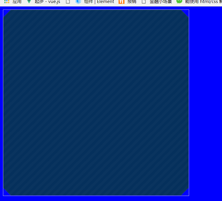
| body{background-color: blue}
.box{
width: 500px;
height: 500px;
position: relative;
border:1px solid #ccc;
background-image: linear-gradient(-45deg, rgba(255, 255, 255, 0.02) 25%, transparent 25%, transparent 50%, rgba(255, 255, 255, 0.02) 50%, rgba(255, 255, 255, 0.02) 75%, transparent 75%, transparent);
background-size: 20px 20px;
}
.box::before {
content: '';
display: block;
position: absolute;
left: 0;
top: 0;
z-index: -1;
width: 100%;
height: 100%;
background-color: #05305C;
background: linear-gradient(135deg, transparent 15px, #173B6B 0, #173B6B 16px, transparent 15px, #05305C 0) top left, linear-gradient(-135deg, transparent 15px, #173B6B 0, #173B6B 16px, #05305C 0) top right, linear-gradient(-45deg, transparent 15px, #173B6B 0, #173B6B 16px, #05305C 0) bottom right, linear-gradient(45deg, transparent 15px, #173B6B 0, #173B6B 16px, #05305C 0) bottom left;
background-size: 51% 51%;
background-repeat: no-repeat;
}
|